Revenue Analytics

The metrics your
board asks about

MRR, NRR, GRR, cohort retention, survival curves — all calculated automatically from your Stripe data. No spreadsheets, no formulas, no analyst needed.

14-day free trial No credit card Setup in 3 clicks
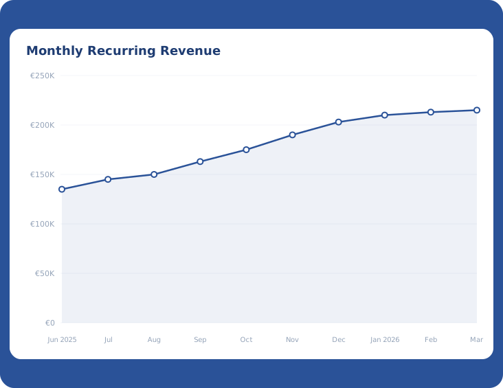
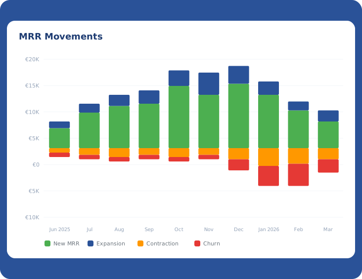
MRR Chart MRR Movements
Verified on: Stripe Apps HubSpot Marketplace

Your Stripe dashboard wasn't built for this

Stripe shows you payments. Revenue Plumber shows you what those payments mean — MRR movements, retention rates, cohort behavior and the trends that matter for your next board meeting.

Spreadsheets & Stripe Dashboard
  • Manual MRR calculations that break every month
  • No cohort analysis without a data team
  • NRR and GRR? Build it yourself in sheets
  • Hours of prep before every board meeting
Revenue Plumber
  • MRR calculated automatically from Stripe
  • Cohort tables and survival curves out of the box
  • NRR, GRR and MRR movements — always up to date
  • Board-ready charts in seconds, not hours

Every metric that matters. Zero setup.

Connect Stripe and get a full SaaS analytics dashboard — automatically calculated, always current, broken down by plan.

1

See where your revenue is really going

Track Monthly Recurring Revenue over time and break it down into what's driving change — New MRR, Expansion, Reactivation, Contraction and Churn. No more guessing which direction the business is heading.

2

Retention rates your investors actually want

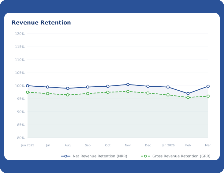
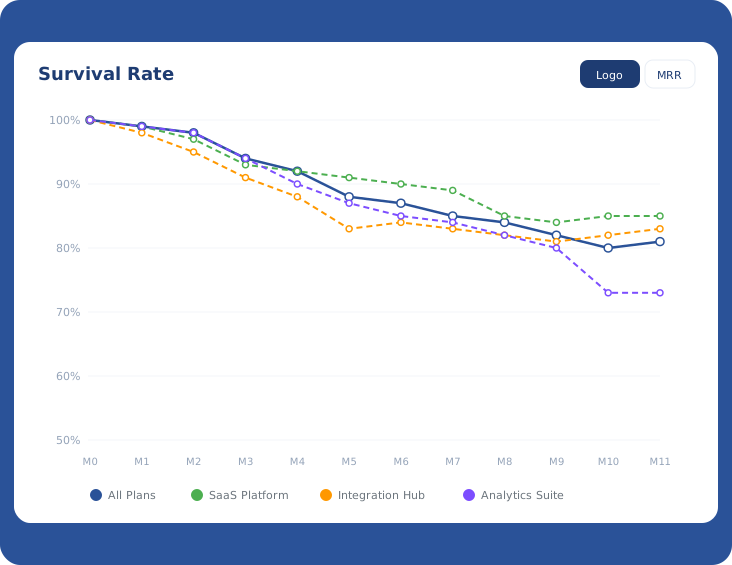
Net Revenue Retention, Gross Revenue Retention and survival curves — calculated monthly, broken down by plan. Know exactly how well you're keeping revenue and where the leaks are. No spreadsheet gymnastics required.

3

Cohort analysis that tells the real story

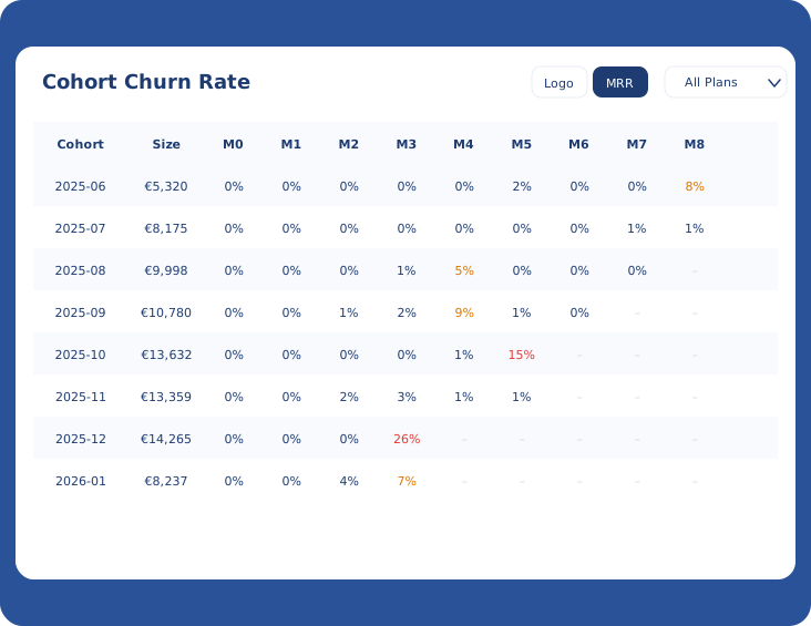
See churn rate by signup cohort — month by month, plan by plan. Spot which cohorts retain well and which ones bleed out early. Toggle between logo churn and MRR churn to see both sides of the picture.

Cohort Churn Rate Table

Explore more capabilities

Analytics pairs with prediction and prevention to give your team the full picture.

Frequently Asked Questions

Directly from your Stripe account. Connect with three clicks and Revenue Plumber calculates every metric automatically — MRR, NRR, GRR, cohort retention, survival rates, MRR movements. No CSV imports, no manual data entry.

Revenue Plumber normalizes all your Stripe subscriptions to monthly values and tracks changes over time. It classifies every movement as New, Expansion, Reactivation, Contraction or Churn MRR — so you see exactly what's driving your revenue up or down each month.

Yes. Every chart and table can be filtered by plan — survival curves, cohort churn rates, MRR movements. You can see which plans retain well and which ones bleed customers.

Logo churn counts customers lost. MRR churn measures revenue lost. You can have low logo churn but high MRR churn if your biggest customers are leaving. Revenue Plumber lets you toggle between both views in every chart with one click.

Daily. Every morning your dashboard reflects the latest subscription changes from Stripe. You always see the freshest numbers without lifting a finger.

For SaaS revenue metrics — no. Revenue Plumber covers MRR tracking, retention rates, cohort analysis and survival curves. If you need product analytics (feature usage, funnel conversion), you'll still want a tool like Mixpanel or Amplitude alongside.

Stop guessing your numbers.

14-day free trial · No credit card required · Set up in under 5 minutes